
SCHOOL OF TYRANNUS
The Challenge: Bridging the "Drop-off Gap"
An e-learning platform with a 60% completion rate might appear stable, but a deep dive into the data revealed a critical fracture: 40% of learners were churning within the first 14 days. This wasn't a content problem; it was a friction problem. Feedback indicated that learners felt lost in "dead-end" navigation and disconnected from their own progress, leading to a rapid decline in motivation.
The Strategic Question:
"How might we transform a fragmented learning path into an intuitive, self-propelling journey that balances cognitive load with emotional reward?"
Discovery & Behavioral Analysis
I led a comprehensive discovery phase to map the friction points against user psychology:
User Research: Synthesized insights from 50+ learners to identify that "Progress Blindness" was the primary driver of abandonment.
Data Archeology: My analysis of user behavior data pinpointed a consistent drop-off after Module 2, correlating exactly with where the navigation became nested and "hidden".
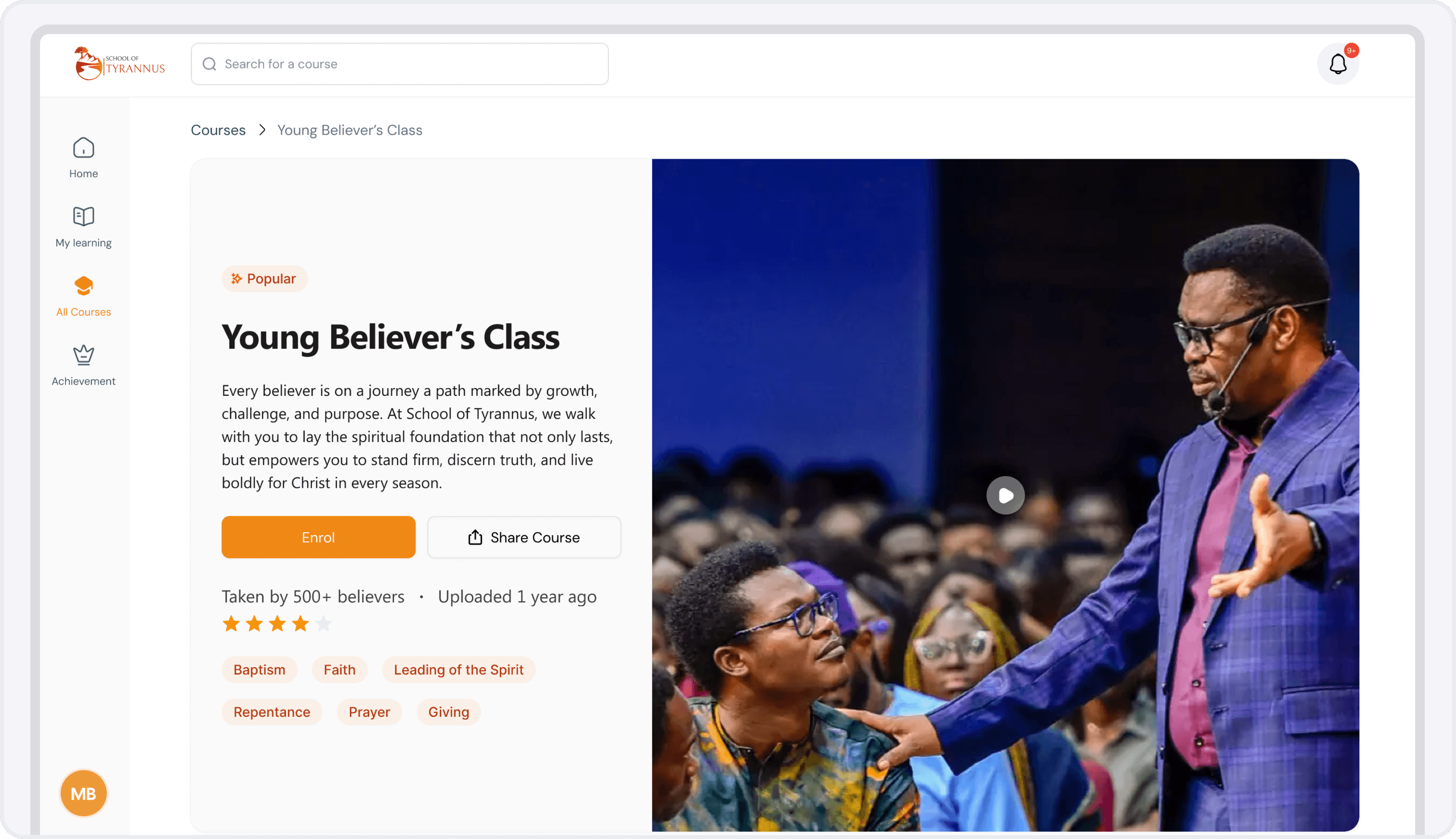
Competitive Benchmarking: Studied top-tier SaaS and EdTech patterns to identify opportunities for differentiation through high-fidelity micro-interactions and "calm" UX.
The Solution: Engineering a "Guided Adventure"
I focused on three strategic pillars to move from transactional interfaces to experiential design.
Eliminating "Choice Paralysis" through Navigation
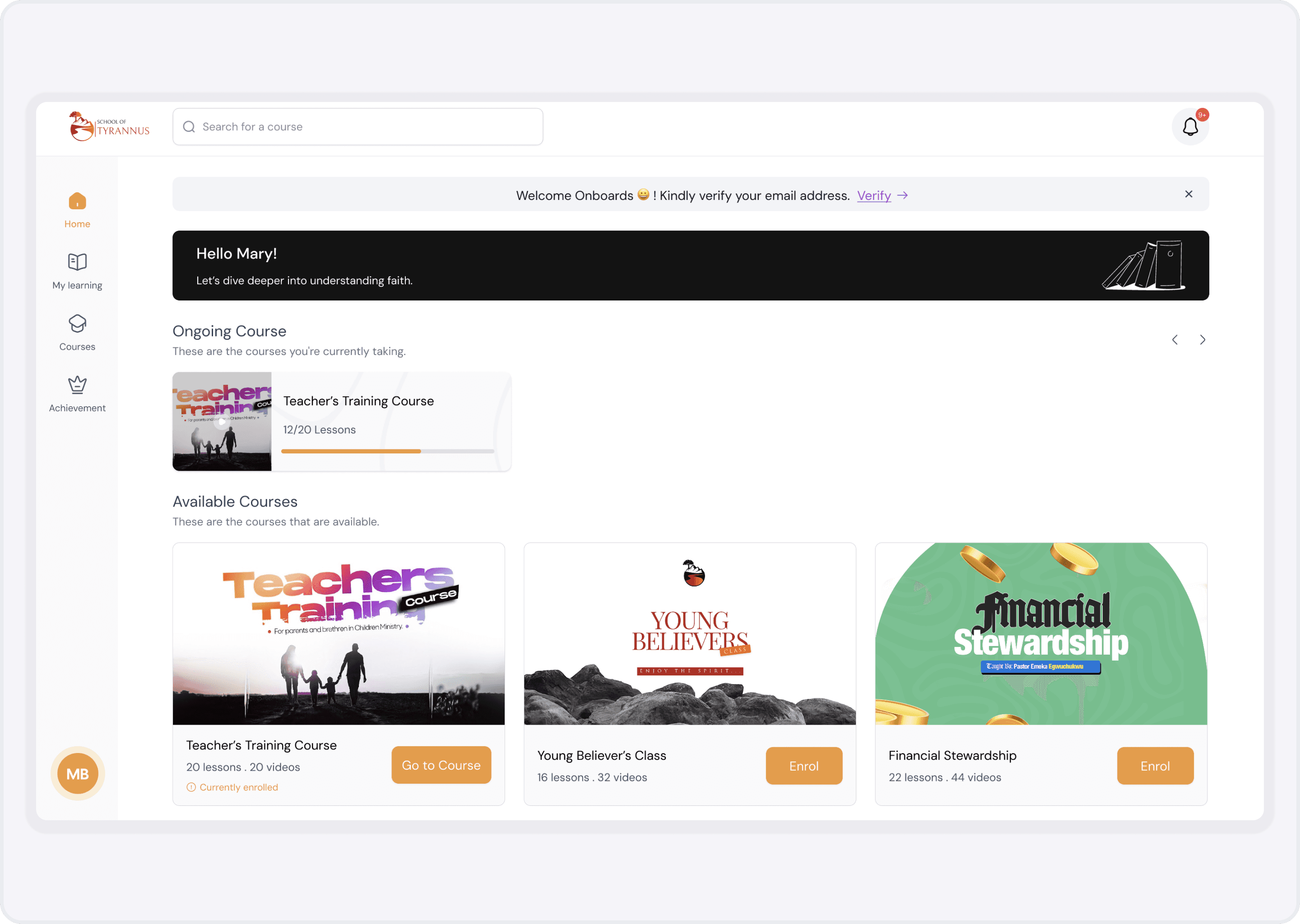
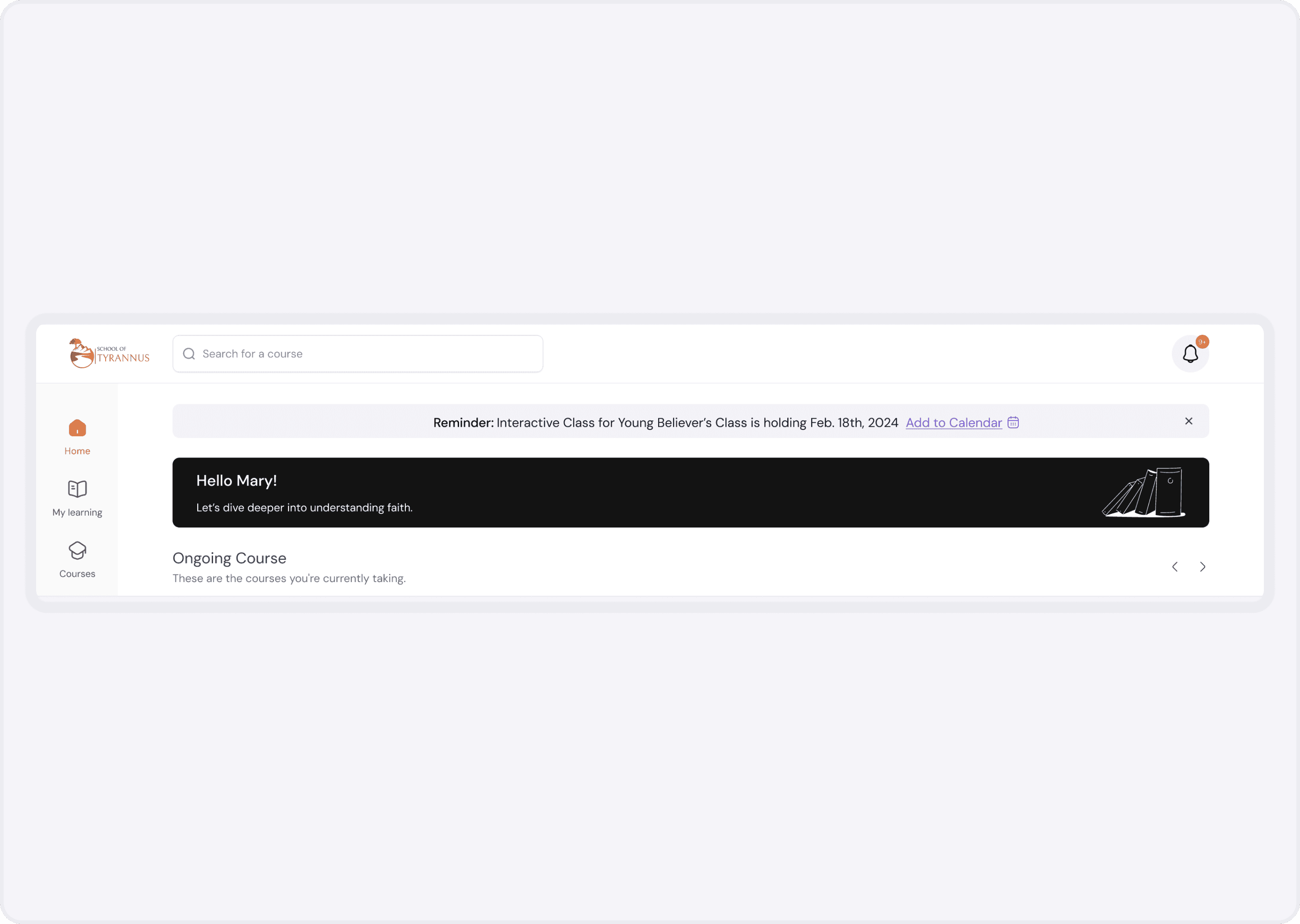
Before: Courses were buried in nested menus, forcing learners to "hunt" for their next lesson.
After: Engineered a high-visibility dashboard with a primary "Continue Learning" CTA anchored above the fold.
The Logic: I leveraged the Zeigarnik Effect, ensuring that incomplete tasks remained visually present to create a productive "mental tension" that encouraged return visits.
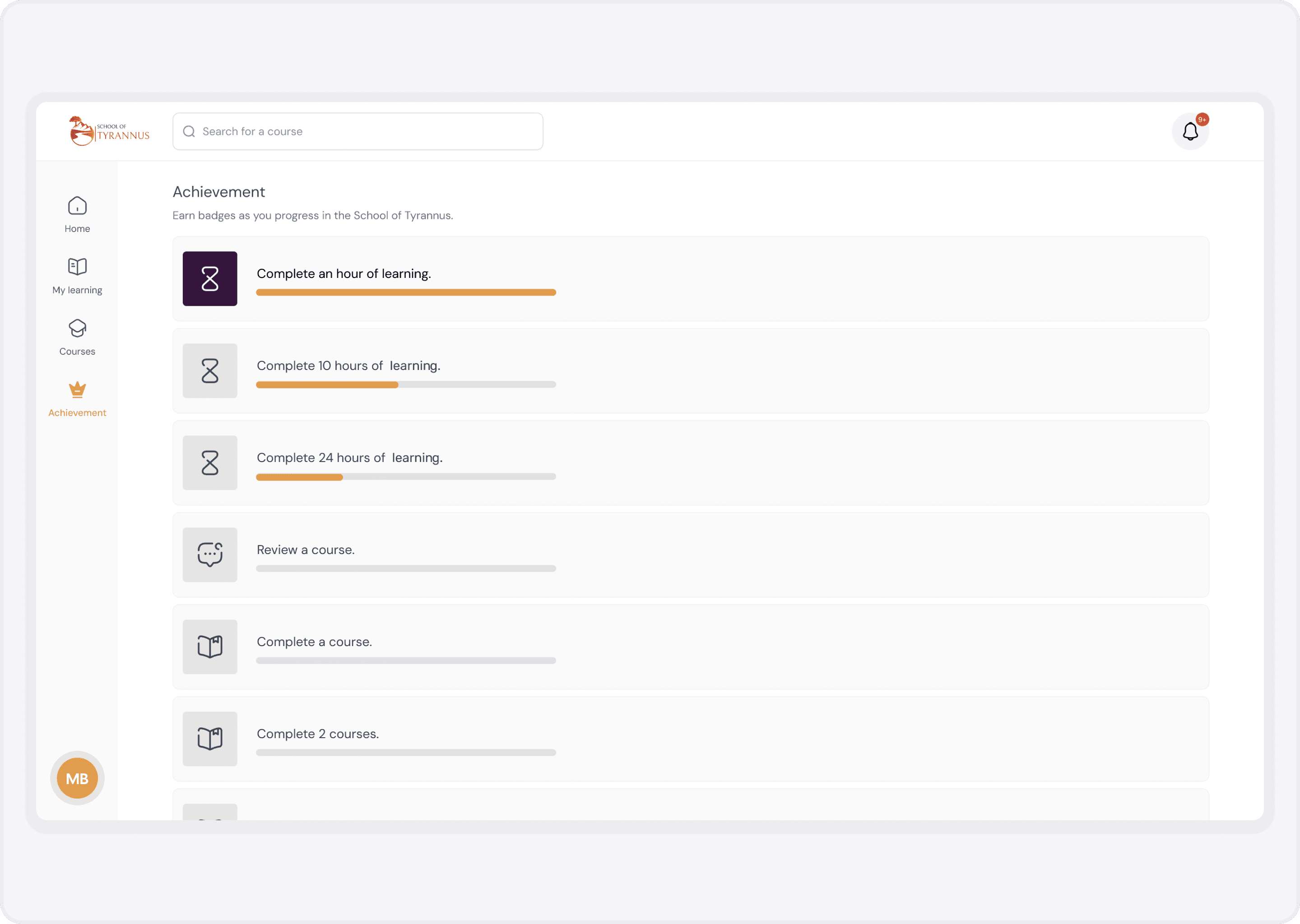
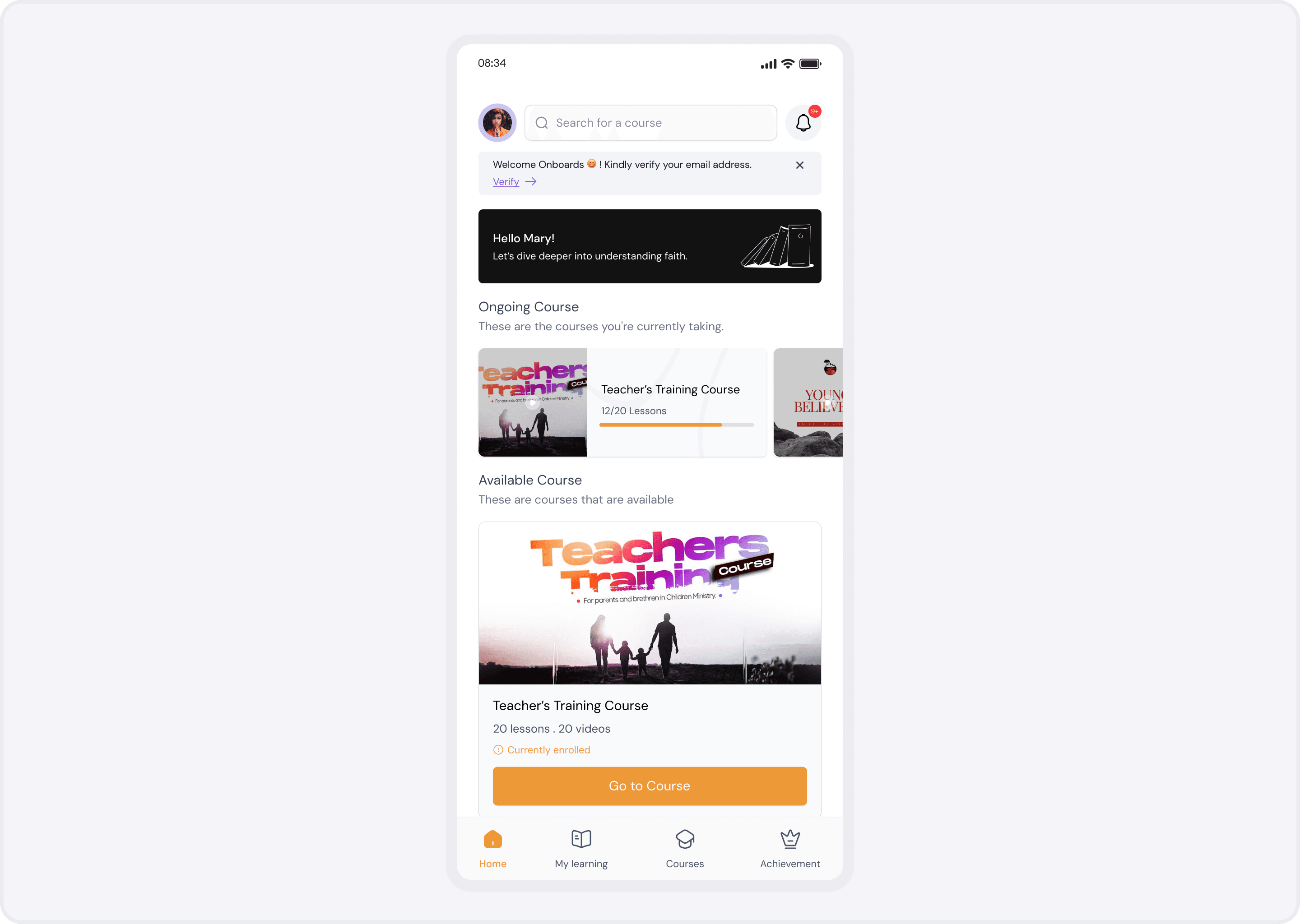
Intrinsic Motivation via Goal-Gradient Design
I moved beyond "points and badges" to implement a sophisticated gamification layer focused on achievement:
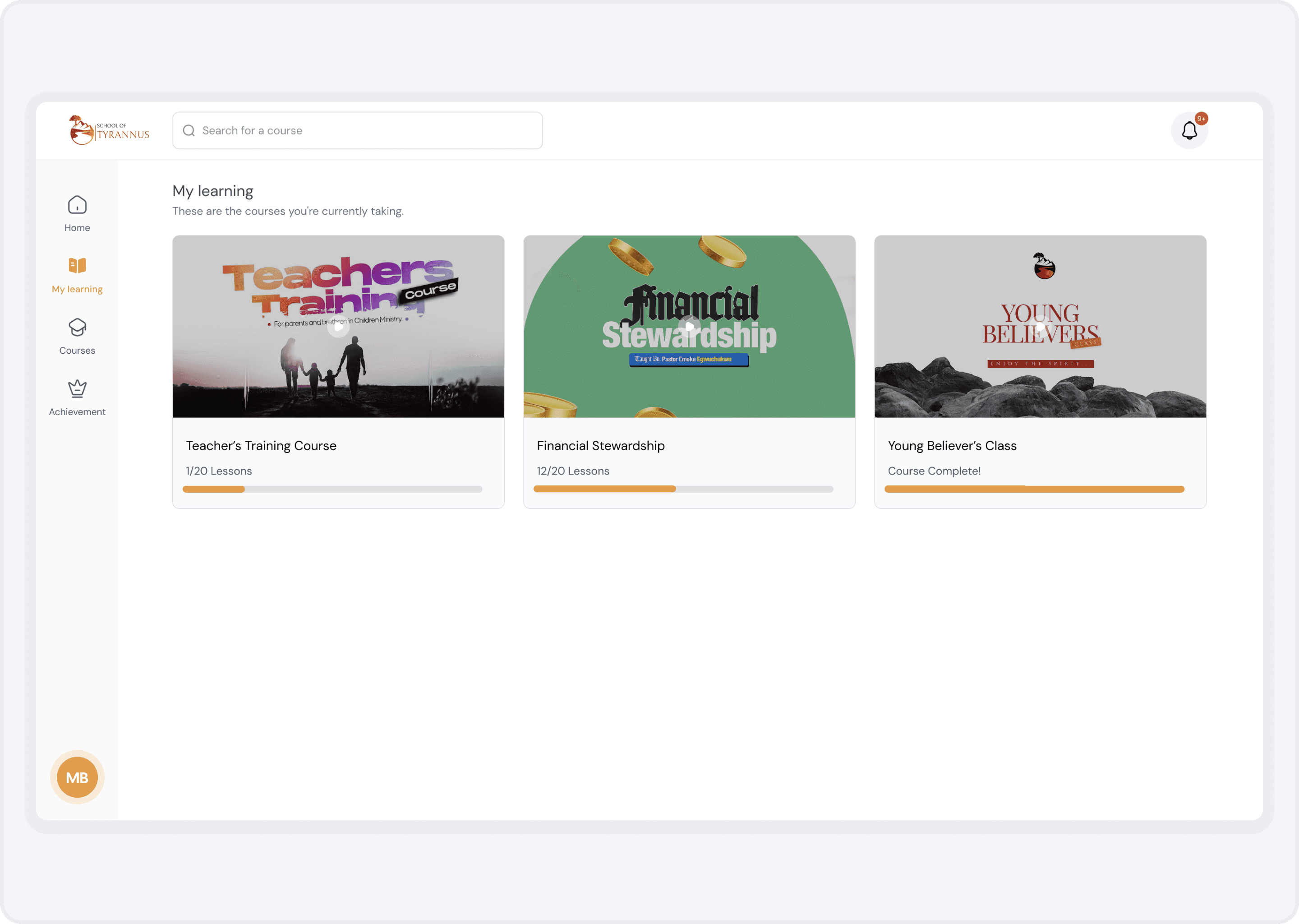
Dynamic Progress Architecture: Real-time progress bars that visualized proximity to the next milestone.
The Logic: By applying the Goal-Gradient Effect, we increased user effort as they neared milestones, transforming a long course into a series of achievable wins.
Closing the Feedback Loop: Nudge Theory
Automated Celebration: Integrated congratulatory micro-interactions at 25%, 50%, and 75% completion markers to provide emotional buy-in.
Strategic Reminders: Designed a low-friction notification system that acted as a "Survival Buddy" for learners who had stalled, focusing on encouragement rather than guilt.
Mobile-First Optimization
Knowing that 45% of users accessed the platform on the go, I re-engineered the mobile experience for one-handed use:
Contextual UI: Sticky CTAs and swipeable cards optimized for mobile-first engagement.
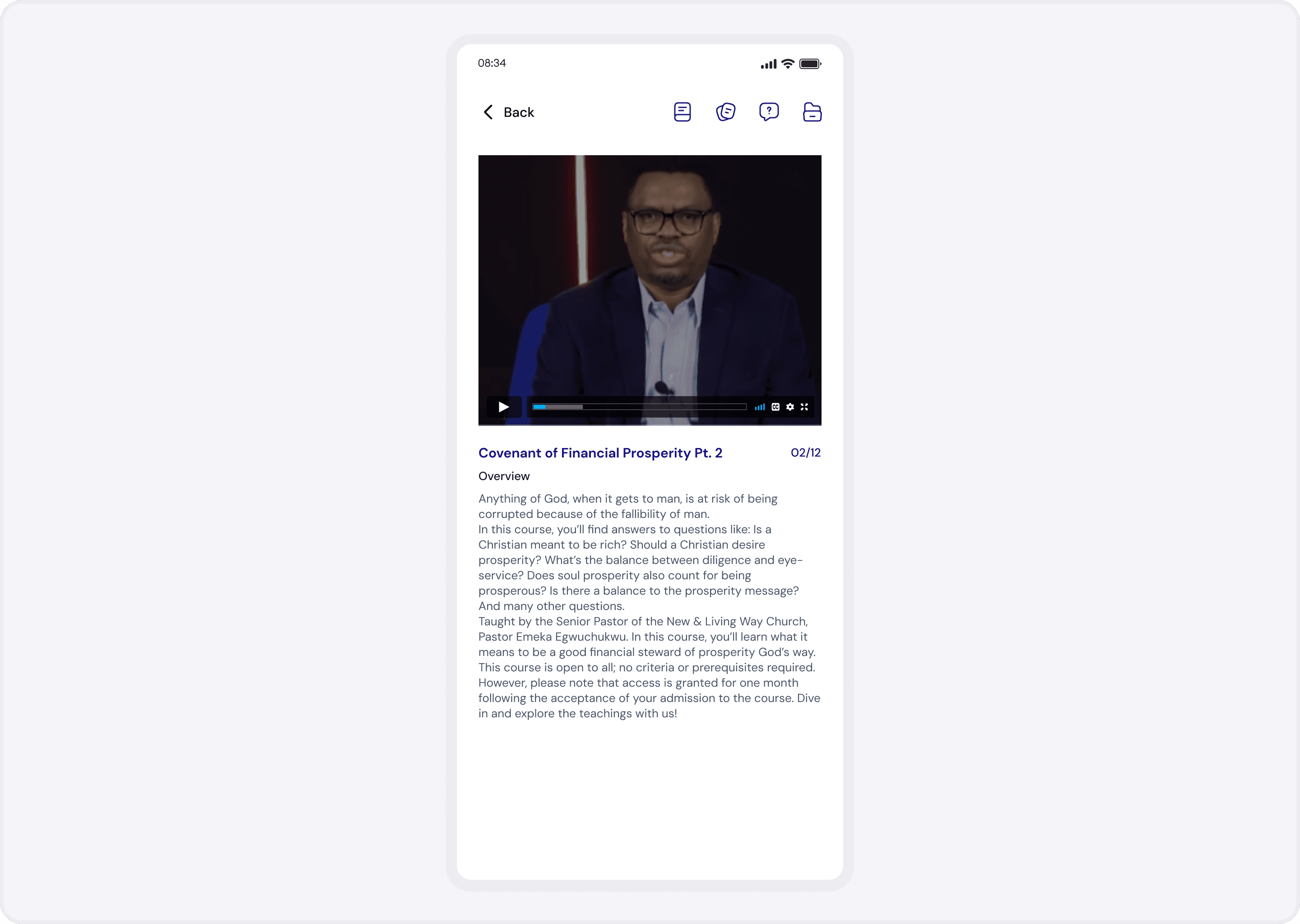
Offline Continuity: Ensured the learning journey remained uninterrupted regardless of connectivity.
The Impact: Quantifiable Success
The redesign shifted the platform from a content library to a high-performance learning ecosystem:
Retention: Slashed abandonment from 40% to 10% within three months.
Efficiency: Completion rates jumped by 78%.
Satisfaction: 94% of learners reported a smoother, more intuitive journey.
Engagement: Average time on platform increased by 64%.
Retrospective: Designing for the Human Element
This project reinforced my belief that Product Design is Behavioral Science.
Precision over Polish: Small cognitive nudges like the "Peak-End" rule applied during celebrations had a larger impact on retention than any visual overhaul.
Accessibility as a Core Metric: Designing for mobile-first and low-bandwidth scenarios taught me that a product is only "genius" if it is accessible to everyone, everywhere.