
Problem Statement
At first glance, an e-learning platform with 60% course completion might seem decent. But look closer: over 40% of learners dropped out within the first two weeks. That’s not just a statistic it’s a cry for help. Feedback pointed to three culprits: unclear navigation, waning motivation, and a lack of connection to progress.
“How might we transform a confusing journey into an inspiring, guided adventure?”
Research and Analysis
To identify the root causes of the problem, I conducted a comprehensive discovery phase:
User Surveys: Gathered insights from 50+ learners about their frustrations and motivations. Common pain points included confusing course structures, difficulty tracking progress, and insufficient reminders.
Analytics Review: Examined user behavior data, revealing that most drop-offs occurred after Module 2, correlating with a lack of clear guidance and progress feedback.
Competitor Analysis: Studied similar platforms to understand industry best practices and identify areas for differentiation.
Designing for Clarity and Motivation
With the core issues identified, I zeroed in on three pillars:
Simplifying Navigation
Enhancing Motivation
Improving Engagement
But I didn’t just apply checkboxes. I asked:
“How might we make learners feel guided at every step?”
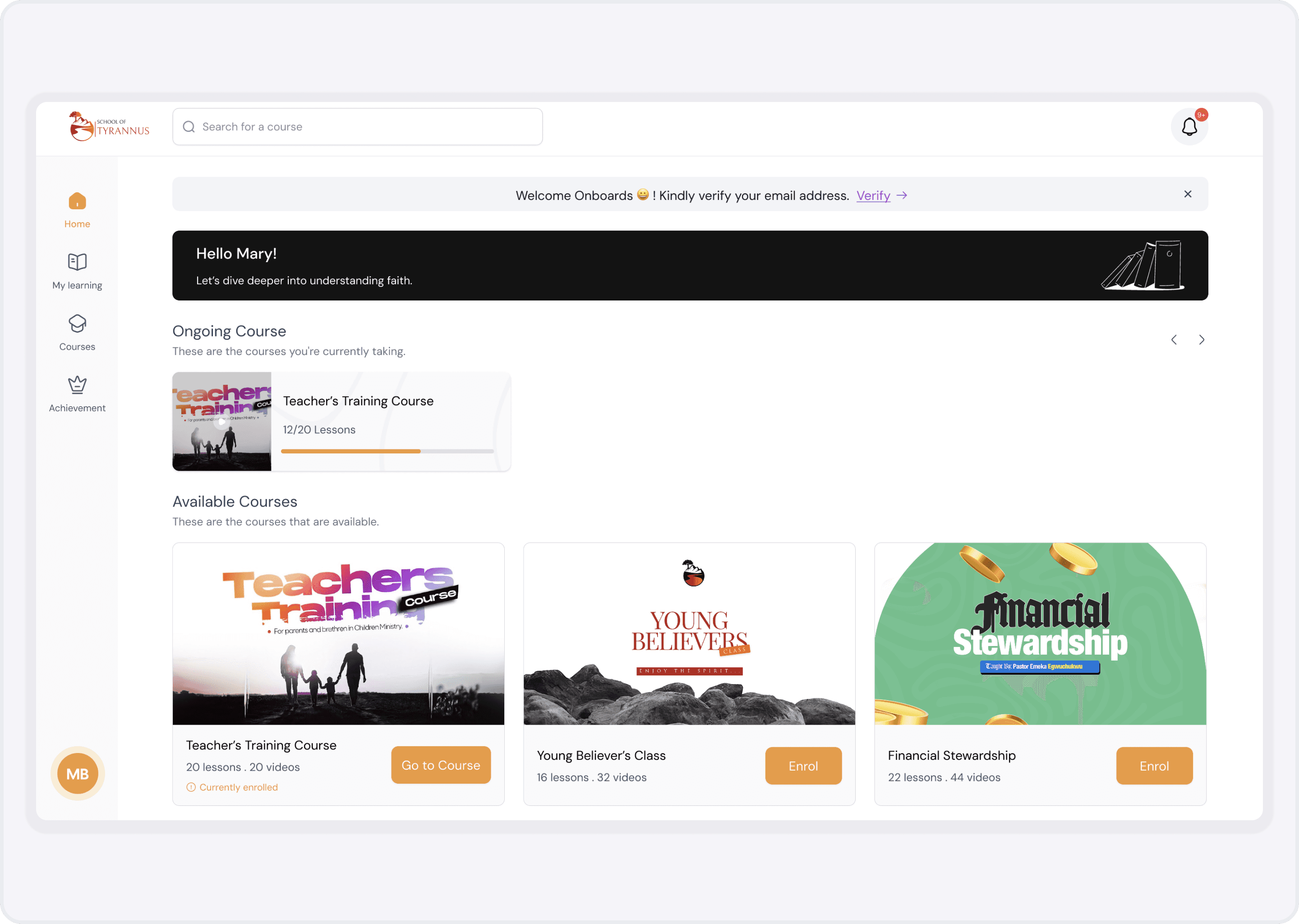
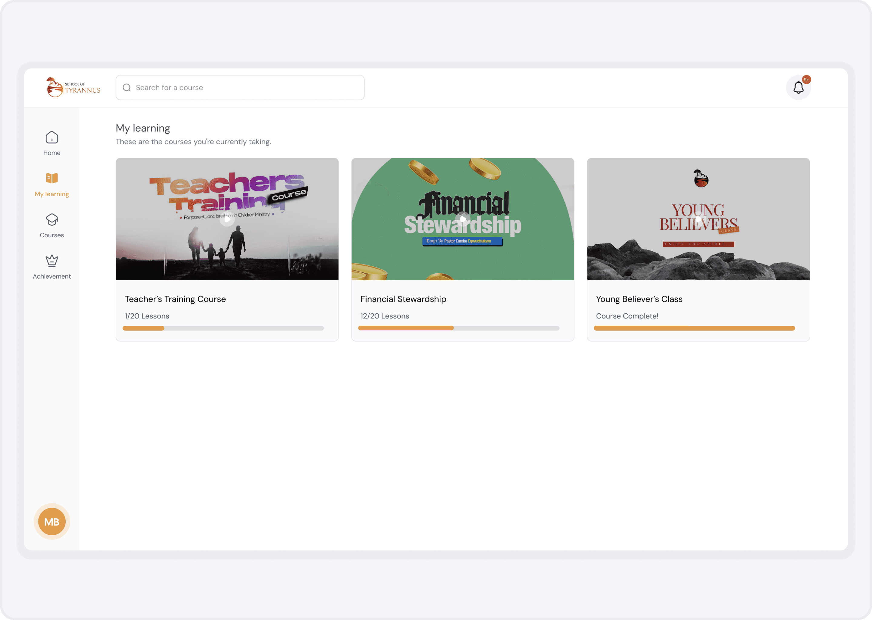
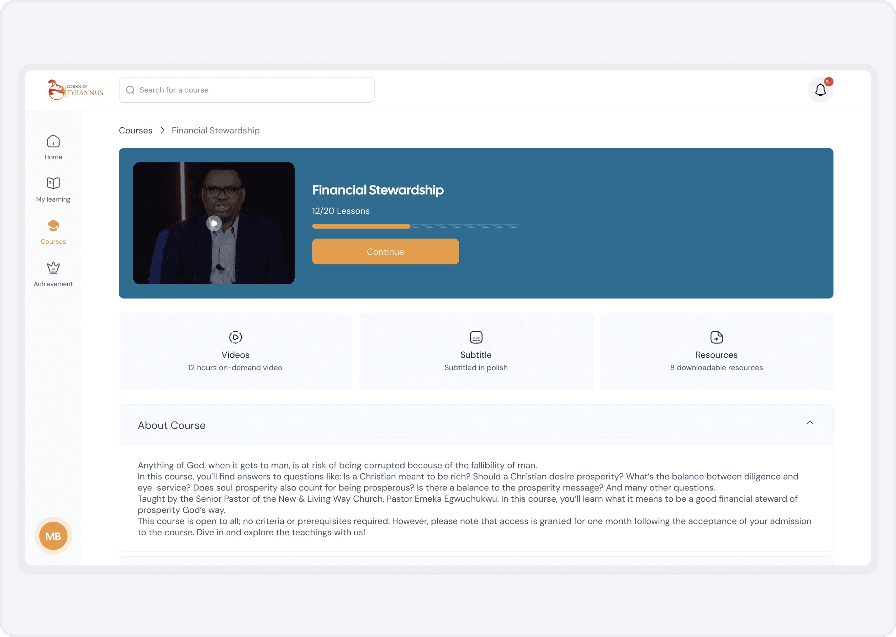
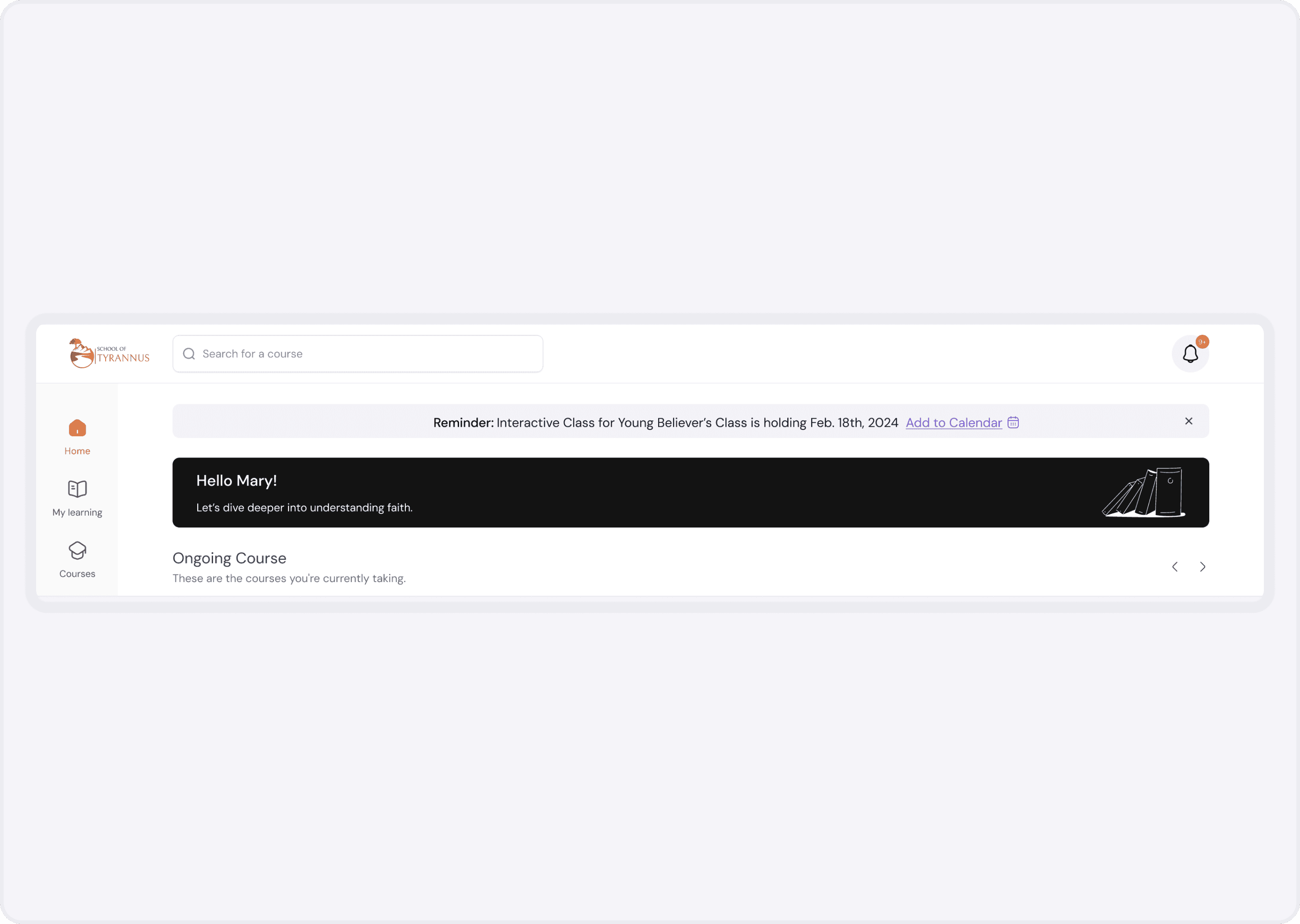
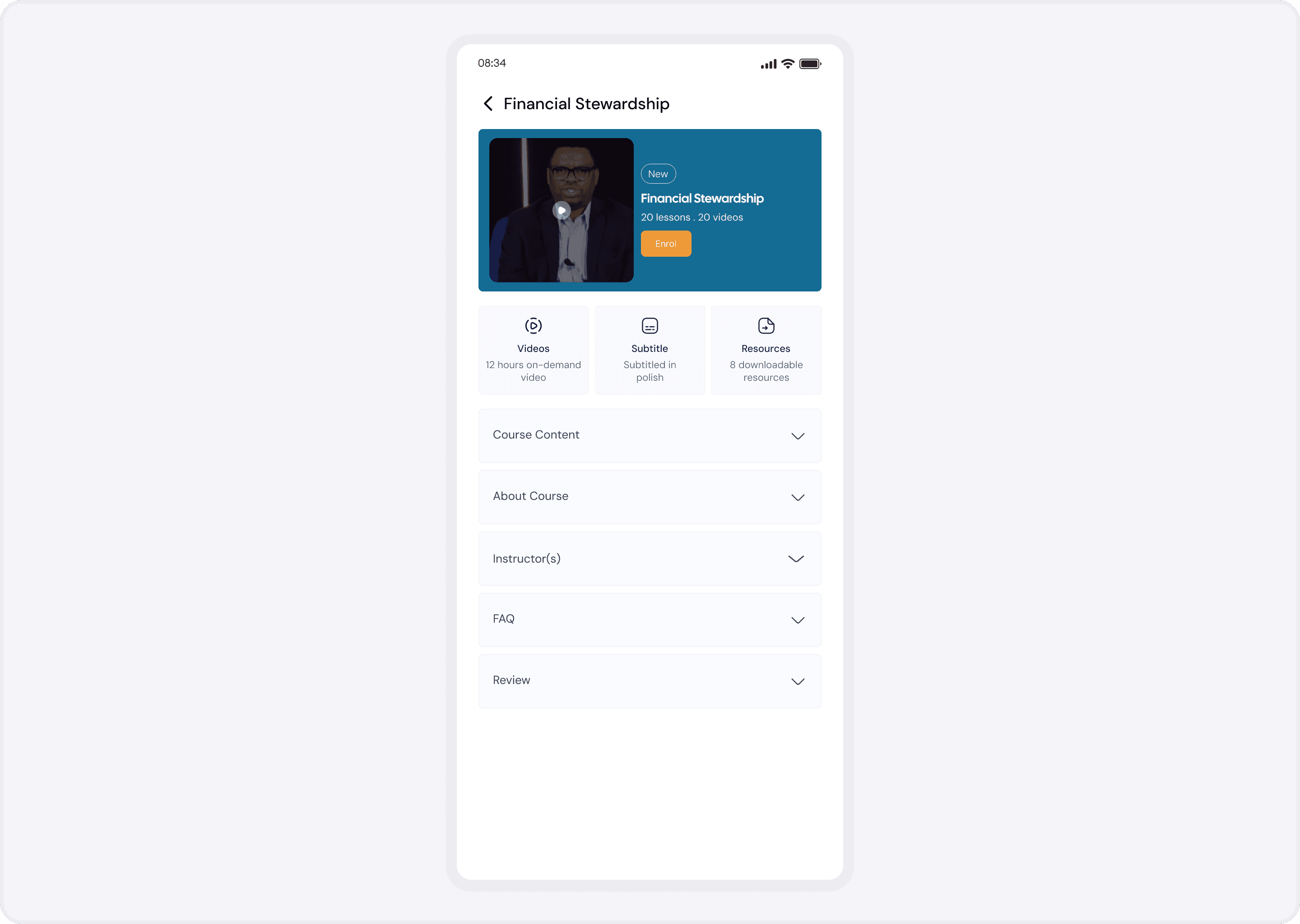
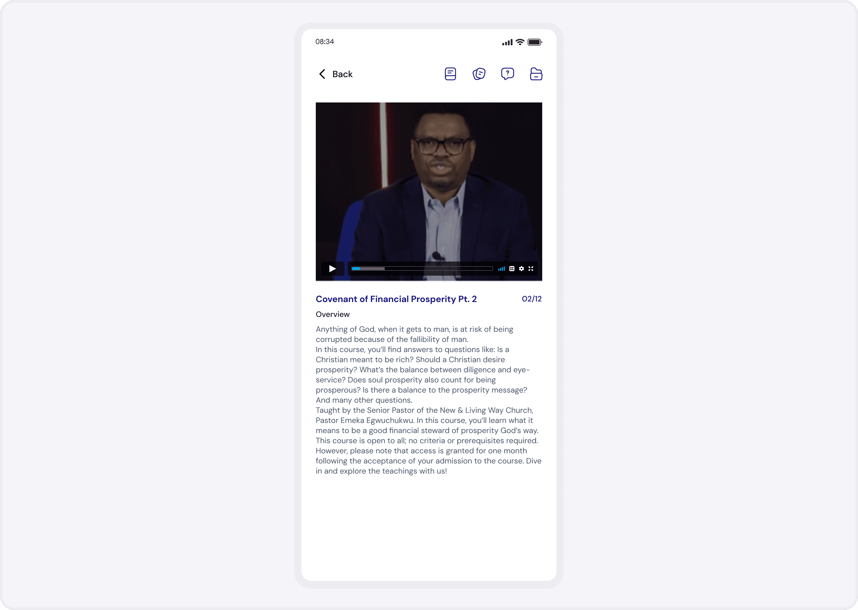
Solution 1: Streamlined, Intuitive Navigation
Before: Courses hidden in nested menus. Learners hunted for their next lesson.
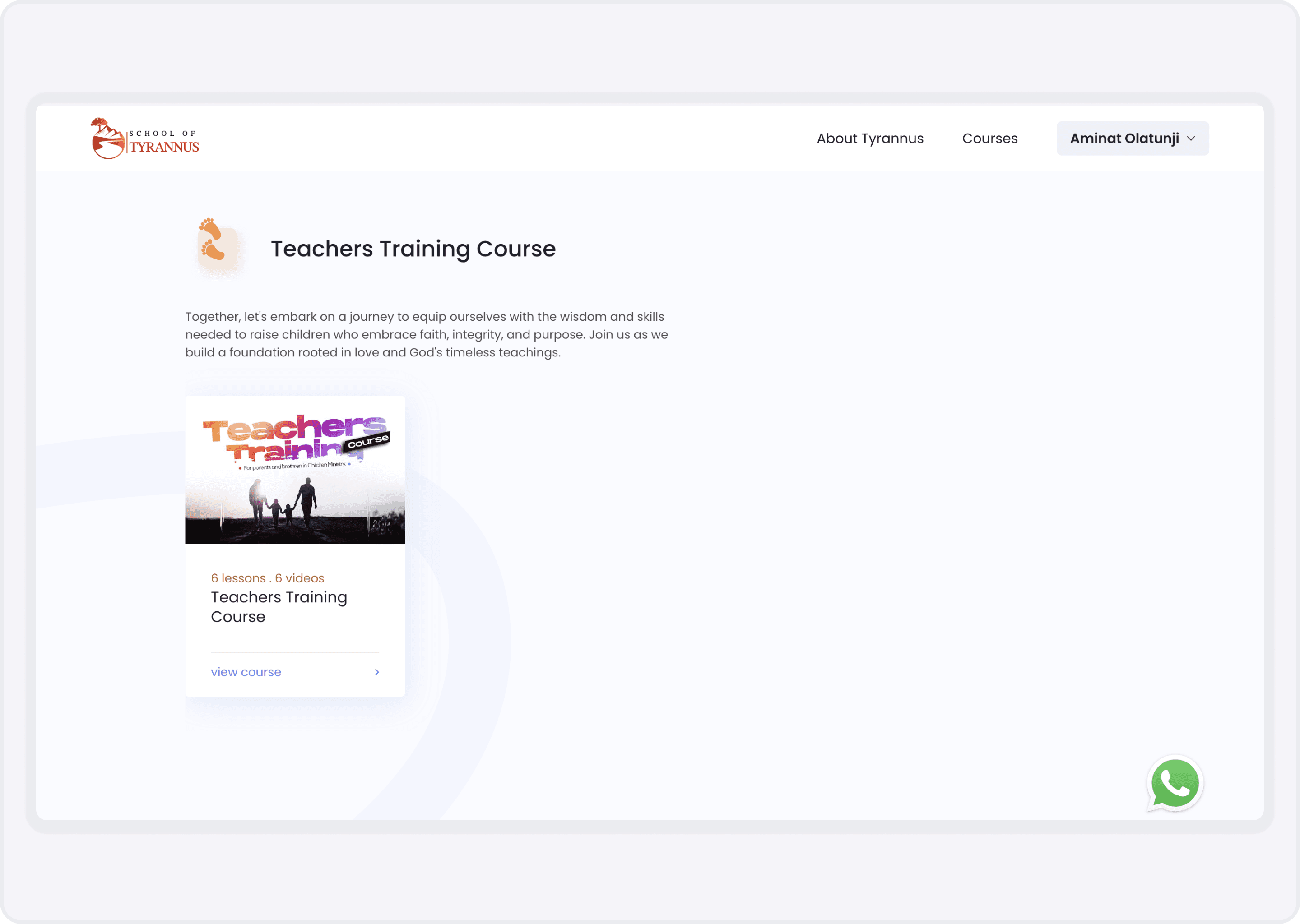
After: A dashboard that greeted learners with all their enrolled courses, each featuring a prominent “Continue Learning” button.
UX Strategy: Placed primary actions above the fold.
Psychology: Leveraged the Zeigarnik effect, knowing that visible, incomplete tasks create mental tension and motivation to finish what’s started.
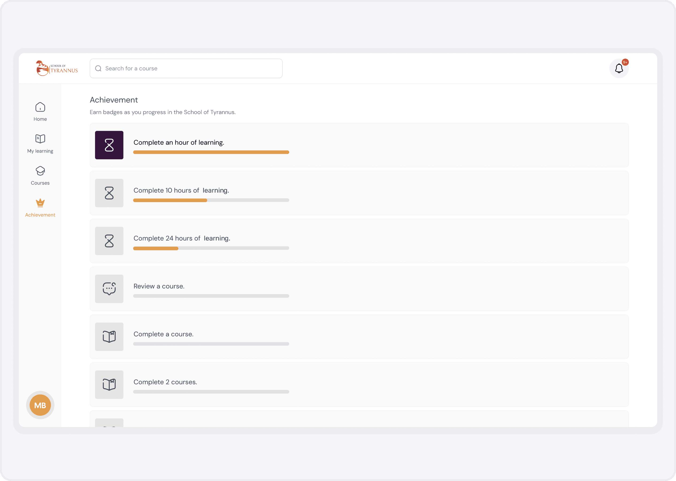
Solution 2: Gamification to Spark Motivation
Introducing badges, rewards, and a dynamic progress bar wasn’t about shiny screens, it was about tapping into intrinsic drives.
Earn a “Achievement” badge foreach major milestones completed.
Watch a progress bar fill in real time.
These elements played on the goal-gradient effect as learners saw themselves get closer to a reward, their effort naturally increased.
Solution 3: Milestones, Reminders & Celebrations
Knowing that people need both guidance and encouragement, I added:
Visual Milestones: Illustrated markers at key points (e.g., “25% complete: Halfway there!”).
Automated Emails: Friendly reminders when a learner stalled, and congratulatory messages when they hit milestones.
This blend of nudge theory and positive reinforcement made learners feel both accountable and celebrated.
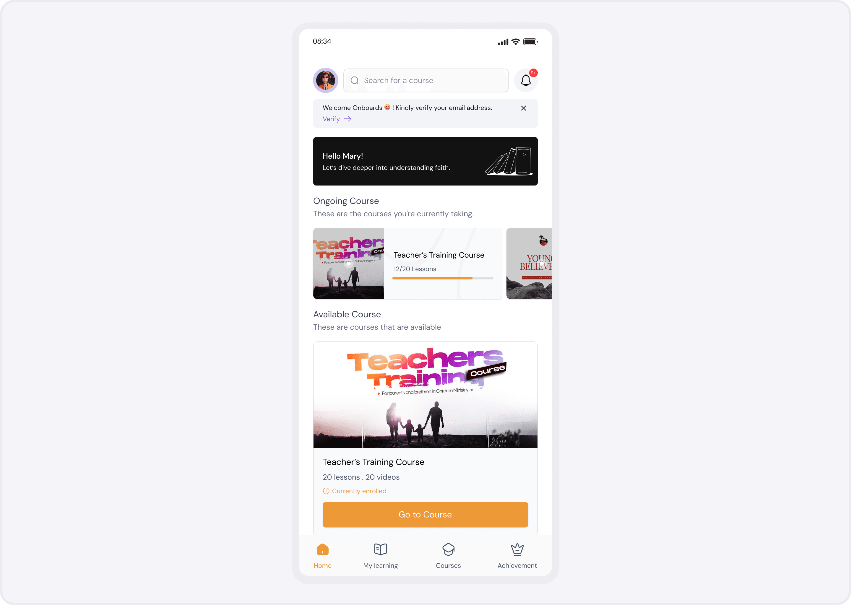
Solution 4: Mobile-First Revamp
Data showed 45% of sessions happened on mobile. So, I re-engineered the flow for smaller screens:
Sticky “Continue” CTA on scroll.
Swipeable lesson cards for quick browsing.
Offline download options for on-the-go learning.
This ensured that motivation never hinged on device or location.
Impact: Numbers That Tell the Story
Course Abandonment Rate: Slashed from 40% to 10% in three months
Average Completion Rate: Up 78%
Learner Satisfaction: 94% reported a smoother journey
Engagement: Time on platform per learner jumped 64%
Key Learnings: Designing Beyond Screens
User-Centric Insights Matter: Deep discovery revealed not just what broke, but why it broke.
Psychology Drives Action: From the Zeigarnik effect to goal-gradient bias, small cognitive nudges create big behavior changes.
Iterate and Celebrate: Continuous testing and positive reinforcement kept learners and stakeholders engaged.
The takeaway: Great e-learning isn’t just a library of content; it’s a graduated journey that guides, motivates, and rewards learners every step of the way.
